Anomaly Detection
Table of Contents
Terminology
| Term | Meaning |
|---|---|
| Spread / Dispersion | How far data points are from the center or each other. Low spread = tight cluster, high spread = wide scatter. Measured by variance, std dev, IQR, MAD. |
| Outlier / Anomaly | A data point that differs significantly from the rest — unusual enough to warrant investigation. |
| Normal Distribution | Bell-shaped, symmetric curve where mean = median = mode. Many statistical methods assume this. |
| Skewed Distribution | Asymmetric tail on one side. Mean shifts toward the tail; median is a better center measure. |
| Robust | Not overly affected by outliers or non-normal data. Median and MAD are robust; mean and std dev are not. |
| Univariate | Analyzing one variable at a time (e.g., checking each column for outliers separately). |
| Multivariate | Analyzing multiple variables together — an outlier may only appear unusual when you consider relationships between variables. |
| Percentile | The value below which a given percentage of data falls (e.g., 95th percentile means 95% of values are below it). |
| Z-score | How many standard deviations a value is from the mean. Used to flag outliers when data is normal. |
| Standardization / Normalization | Scaling features so they’re comparable — critical when using distance-based methods like kNN, LOF. |
Distribution Types
Distribution types notebook — interactive code for all four distributions below.
| Distribution | Shape | Properties | Used When |
|---|---|---|---|
| Uniform | Flat, constant height | Every value equally likely, no peaks | Random sampling, simulations, baseline comparisons |
| Normal | Bell-shaped, symmetric | Mean = median = mode, 68-95-99.7 rule | Natural measurements (height, error), most statistical methods assume this |
| Exponential | Starts high, decays right | Positive skew, memoryless, models waiting times | Time between events (arrivals, failures, requests) |
| Lognormal | Right-skewed, long tail | Logarithm is normal, values are positive | Income, stock prices, property values — cluster low but can spike high |
Statistical Measures - Descriptive Statistics
Mean
- What: Average of all values (sum ÷ count)
- Use when: Normal distributions, no outliers, need interpretability
- Don’t use when: Outliers present, skewed data (income, response times)
- Formula:

Median
- What: Middle value when sorted (50th percentile)
- Use when: Outliers exist, skewed distributions, need robust center
- Don’t use when: Perfect normal data, need mathematical operations, very small samples
- Formula:

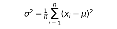
Variance
- What: Average squared distance from mean
- Use when: Measuring spread, normal data, statistical modeling
- Don’t use when: Outliers present, need interpretable units, heavy-tailed distributions
- Formula:
Percentiles
- What: Value below which X% of data falls (e.g., 25th, 95th)
- Use when: Setting thresholds, skewed data, SLA monitoring (p99 latency)
- Don’t use when: Small datasets (<30), need smooth math properties
- Formula:

Robust Statistical Methods
The below is used for univariate outlier detection and spread measurement when data is non-normal or contains outliers.
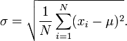
Standard Deviation
- What: Square root of variance (spread in original units)
- Use when: Describing spread, normal data, Z-scores, confidence intervals
- Don’t use when: Outliers present, skewed data (use IQR/MAD instead)
- Details
- Uses mean as the center
- Measures average distance from mean
- Sensitive to outliers - one extreme value can inflate it dramatically
- Assumes roughly normal distribution
- Formula:
Median Absolute Deviation (MAD) ⭐
What: Median of absolute deviations from median (robust spread measure)
Use when: Outliers present, skewed data, production systems, finance/manufacturing
Don’t use when: Perfect normal data where standard deviation suffices
Details
- Uses median as the center
- Measures median distance from median
- Robust to outliers - extreme values don’t distort it
- Works with any distribution shape
Formula:

Interquartile Range (IQR)
- What: Distance between 75th and 25th percentiles (middle 50% spread)
- Use when: Outlier detection, box plots, skewed distributions, quick EDA
- Don’t use when: Small samples (<20), need precise statistical modeling
Tukey’s Fences
- What: Outlier boundaries at Q1 - 1.5×IQR and Q3 + 1.5×IQR
- Use when: Quick outlier flagging, exploratory analysis, box plot rules
- Don’t use when: Need domain-specific thresholds, multivariate data
- Box Plot is one of the visualization that often uses Tukey’s fences
Z-Score (Standard Score)
- What: Number of standard deviations a value is from the mean: (x - mean) / SD
- Use when: Normal data, standardizing features, detecting outliers in clean data (|z| > 3)
- Don’t use when: Outliers present (use Modified Z-score), skewed data, small samples
- Formula

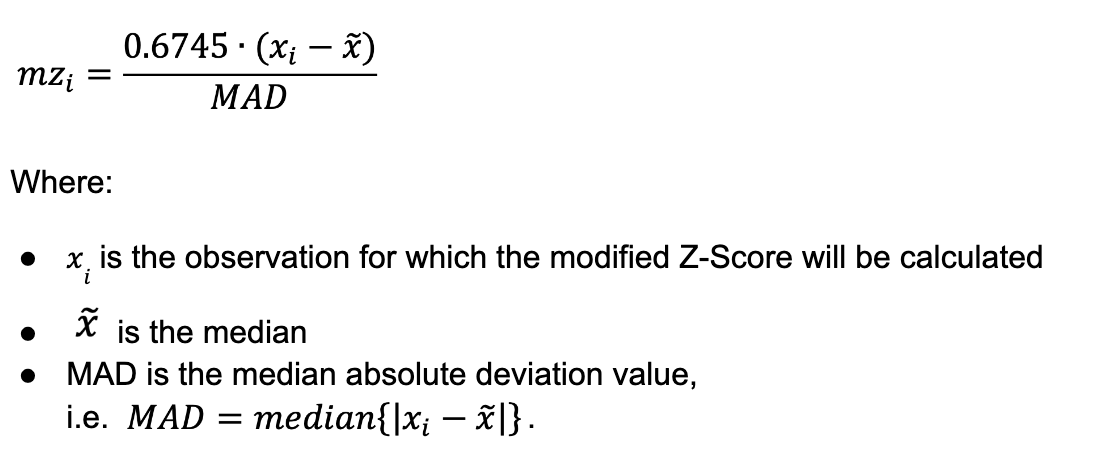
Modified Z-Score
- What: Z-score using median and MAD instead of mean and SD
- Use when: Outliers contaminate mean/SD, need robust standardization
- Don’t use when: Clean normal data, classical Z-score works fine
- Forumla
Visualization
Histograms ⭐ — spot distribution shape, outliers at tails
A histogram bins continuous data and counts how many values fall into each bin. The shape reveals location, spread, skew, and modality, and isolated bins at the tails often flag extreme values.
Use when: Exploratory data analysis, understanding univariate distribution shape, detecting gaps or clustering in values, communicating distributions to a general audience.
Don’t use when: When you need to compare distributions across many groups (use box plots or KDE instead), when bin-width choices could mislead, or when data is categorical (use a bar chart).
Box plots ⭐ — immediate visual of IQR outliers
A box plot summarises a distribution through five key statistics: minimum (whisker-end), Q1, median, Q3, and maximum (whisker-end). The box spans IQR (Q1–Q3) with the median as a line. Whiskers reach to the furthest point within 1.5×IQR; points beyond are outliers via Tukey’s fences.
Use when: Comparing distributions across multiple groups, quickly spotting outliers, showing central tendency and spread with skewed data — all in a compact form.
Don’t use when: When you need the exact distribution shape (use a histogram or KDE instead), when sample sizes are very small (<20), or when individual data points matter (use a strip or swarm plot).
Violin plots ⭐ — distribution density + box plot summary
A violin plot combines a box plot with a rotated KDE mirrored on each side. The violin shape reveals the full distribution — peaks, skew, gaps, and tails — while inner lines show the median and IQR.
Use when: When you care about distribution shape (unimodal, bimodal, multimodal), want to compare density across groups, and need more detail than a box plot alone provides.
Don’t use when: When the audience is unfamiliar with reading densities (a box plot is simpler), when you have very few data points (KDE becomes unreliable), or when you only need outlier detection (a box plot suffices).
Q-Q plots — check normality assumptions
A Q-Q (quantile-quantile) plot scatters your data’s quantiles against a reference distribution’s quantiles (usually normal). Points along a straight line indicate the data matches the distribution.
Use when: To test normality assumptions (required for many statistical tests), to compare data against any theoretical distribution, or to compare quantiles of two empirical datasets.
Don’t use when: With very small samples (too few quantiles to assess), when you just want descriptive statistics (use a histogram instead), or when the audience is unfamiliar with Q-Q plots.
Time series plots ⭐ — contextual anomalies, trends, seasonality
A simple line plot of a variable against a time index. Anomalies appear as spikes, dips, level shifts, or changes in seasonality or trend.
Use when: For any data indexed by time — monitoring metrics, sensor readings, stock prices, server logs. First step in any time-series analysis.
Don’t use when: When the time index is irregular without resampling, when only distribution matters (use a histogram instead), or when you need to visualise hundreds of series at once (use a heatmap or small multiples).
Multivariate Visualization
Scatter plots & pair plots ⭐ — bivariate outliers
A scatter plot places each observation as a point in x-y space. Pair plots extend this to all variable pairs in a grid, often with histograms or KDE on the diagonal.
Use when: To visualise relationships, correlations, clusters, and outliers between two (scatter) or many (pair plot) numerical variables. Excellent for spotting non-linear patterns and isolated groups.
Don’t use when: With many more than ~10 variables (pair plot becomes a huge grid; use parallel coordinates or PCA), when variables are categorical (use a coloured box or strip plot instead), or with massive datasets without transparency or subsampling.
Parallel coordinates — high-dimensional patterns
Each variable is drawn as a vertical axis; each observation is a polyline crossing all axes. Outliers stand out as lines that deviate sharply from the main flow.
Use when: For high-dimensional data (5–50 variables), comparing profiles across groups, spotting outliers that violate normal multi-variable patterns.
Don’t use when: With fewer than 4 variables (simpler plots suffice), when variables are not on comparable scales (must normalise first), or when there are too many observations (lines overlap; use opacity or sample).
Heatmaps & correlation matrices — relationship anomalies
A heatmap displays a matrix of values (typically correlations) as a colour grid. Darker or warmer colours indicate stronger relationships.
Heatmap & correlation notebook
Use when: To visualise a correlation matrix at a glance, to identify clusters of correlated variables, or to display distance matrices or missing-data patterns.
Don’t use when: When exact correlation values are needed (annotate cells or use a table), when the variable count is very large (add clustering dendrograms), or when relationships are non-linear (use scatter plots for detailed inspection).
Andrews curves — multivariate data as curves
Each multi-dimensional observation is transformed into a Fourier-series-like curve plotted over t ∈ [−π, π]. Observations cluster into bundles; outliers form curves that stray from the pack.
Use when: For exploring groupings in moderate-dimensional data (up to ~10 variables), as an alternative to parallel coordinates when data has a periodic structure.
Don’t use when: With more than ~10 variables (curves become noisy), with very large datasets (overplotting), or when the audience is unfamiliar with the interpretation (parallel coordinates or PCA are more intuitive).
Distribution Comparison
Empirical CDF plots — compare distributions
The ECDF jumps by 1/n at each data point, showing the proportion of values ≤ x. No bins, no bandwidth — just the data.
Use when: When you need an assumption-free view of the cumulative distribution, when comparing distributions without any smoothing parameters, or when identifying the percentage of data above or below a threshold.
Don’t use when: With massive datasets (the plot becomes dense and slow; subsample first), when the focus is on density shape rather than cumulative probability, or when a general audience expects a histogram.
Kernel Density Estimation (KDE) ⭐ — smooth distribution view
KDE plots a smooth, continuous estimate of the probability density function using a kernel over each data point. It is a histogram with no binning artifacts.
Use when: When you want a smooth distribution shape independent of bin choice, when comparing densities of multiple groups on the same axes, or as a foundation for violin plots and 2D density contours.
Don’t use when: With very small sample sizes (bandwidth becomes unstable), when exact data points need to be visible (use a rug plot or strip plot underneath), or when the audience needs precise frequency counts (use a histogram).
Lag plots — time series autocorrelation patterns
A scatter plot of each value against its value k steps earlier. A linear pattern indicates autocorrelation; a random cloud suggests independence.
Use when: To check for serial dependence, to identify the appropriate lag for autoregressive models, and to spot periodic outliers.
Don’t use when: When data is not time-ordered (no meaningful lag), with very short series (<~50 points), or when seasonality at multiple lags is expected (use an ACF/PACF plot instead).
Advanced Visual Techniques
Control charts ⭐⭐ (Shewhart, CUSUM, EWMA)
Monitor a metric over time with upper and lower control limits. Points outside the limits or non-random patterns signal anomalous shifts.
Advanced visual techniques notebook
Use when: Process monitoring in manufacturing, DevOps, and finance. Detecting mean shifts or variance changes in streaming metrics.
Don’t use when: When univariate methods are insufficient (use Mahalanobis distance for multivariate), or when the metric has strong seasonality (decompose first).
Mahalanobis distance plots — multivariate outliers
A multi-variable distance scaled by the covariance matrix. Accounts for correlations between features so an outlier may only appear unusual when considering multiple variables together.
Advanced visual techniques notebook
Use when: When features are correlated and you need a single multivariate anomaly score. Effective for sensor arrays, multi-metric system health.
Don’t use when: When covariance cannot be reliably estimated (more features than samples), when features are not roughly normal, or when relationships are non-linear.
Cook’s distance — influence plots for regression
Identifies influential points in regression — observations that disproportionately affect the fitted model. High Cook’s distance indicates leverage + large residual.
Advanced visual techniques notebook
Use when: Regression diagnostics, finding points that unduly influence model parameters.
Don’t use when: When you do not have a regression model, or when you rely on a single diagnostic in isolation — always combine multiple views.
Residual plots — model-based anomaly visualization
Scatter plot of residuals (observed − predicted) vs fitted values. A random cloud around zero is ideal; patterns indicate model misspecification or anomalies.
Advanced visual techniques notebook
Use when: To check model assumptions (homoscedasticity, linearity), to spot outliers the model cannot explain.
Don’t use when: When the model is already validated — focus on raw data visualisations instead.
Dimensionality Reduction for Visualization
PCA projection (2D/3D) — visualise high-dimensional outliers
PCA projects high-dimensional data onto orthogonal components that maximise variance. The first two or three components form a low-dimensional scatter plot.
Use when: To reduce dimensionality while preserving global variance structure, as a preprocessing step before clustering, or to decorrelate features.
Don’t use when: When the data has non-linear structure (UMAP is better), when outliers dominate the variance (they bias components), or when the goal is to preserve local neighbourhoods (use UMAP or t-SNE).
UMAP ⭐ — preserve local structure, great for clusters
UMAP builds a nearest-neighbour graph and optimises a low-dimensional embedding that preserves local topology. It produces tight, separated clusters.
Use when: For visualising high-dimensional data with strong local structure, when clusters are expected but non-linearly separable, or when PCA fails to separate known groups.
Don’t use when: When global variance structure matters (PCA preserves that better), when the dataset is small (<~100 points), or when deterministic results are critical (UMAP is stochastic).
t-SNE — good for exploration (not detection)
t-SNE minimises the divergence between pairwise probability distributions in high and low dimensions. Excellent for visualising cluster structure but not suitable as an anomaly detector.
Use when: Exploratory visualisation of high-dimensional data, confirming cluster structure.
Don’t use when: For anomaly detection (distances are not preserved), for production pipelines (non-deterministic), or with very large datasets (slow).
Interactive Dashboards ⭐⭐
Plotly Dash, Grafana, Streamlit — interactive dashboards for real-time anomaly monitoring and exploration.
Use when: Production monitoring, stakeholder demos, real-time alert review, self-service exploration of detection results.
Don’t use when: When a simple static plot suffices, or when the overhead of a dashboard framework is not justified.
Why This Matters: Visual exploration is your first step before algorithms. Many production systems use visual dashboards for real-time monitoring. This is how you communicate findings to stakeholders and validate automated detections. Practice: EDA on various datasets, build interactive dashboards, practice “anomaly spotting by eye”
Phase 2: Distance and Density-Based Methods
Distance Metrics & Scaling
Euclidean, Manhattan, and Mahalanobis distance measure similarity between points. Feature scaling and normalisation are critical — distance-based methods fail when features are on different scales. The curse of dimensionality means distances become uniform in high dimensions, making detection unreliable.
Use when: Multivariate tabular data where anomalies are defined by unusual feature combinations.
Don’t use when: In very high dimensions (>50, distances lose meaning), or when features are not comparable even after scaling.
Core Algorithms
k-Nearest Neighbors (kNN) for outlier detection
Scores each point by the distance to its k-th nearest neighbour. Points far from all neighbours are flagged.
Use when: As a simple, interpretable distance-based baseline. Works well when the anomaly definition is “far from everything.”
Don’t use when: When local density varies across the dataset (LOF is better), with high-dimensional data (distances become meaningless), or with massive datasets (pairwise distances scale poorly; use subsampling or a tree-based method).
Local Outlier Factor (LOF) — detects local anomalies
Compares the local density of a point to that of its neighbours. Points with much lower density than neighbours receive a high LOF score.
Use when: When data has varying-density clusters — a point may be anomalous relative to its neighbourhood even if it sits in a dense global region.
Don’t use when: With high-dimensional data (distances degrade), when global outliers are all that matter (kNN is simpler), or when computation speed is critical (LOF requires kNN for each point).
DBSCAN for clustering-based detection
Groups points that are closely packed together (dense neighbourhoods) and marks points in low-density regions as noise/outliers.
Use when: When clusters are arbitrary-shaped (not just spherical), when you need robust outlier identification as a by-product of clustering, and when the number of clusters is unknown.
Don’t use when: When clusters vary wildly in density (one epsilon parameter cannot capture them all), when data is high-dimensional (curse of dimensionality — use HDBSCAN or a distance-based method first), or when every point must be assigned to a cluster (noise points stay unassigned).
Practice: Multivariate tabular data, customer behavior, transaction records. Always visualize results.
Phase 3: Ensemble Methods & Isolation Forest
Isolation Forest ⭐⭐⭐
Builds random decision trees that partition the data. Anomalies are isolated in fewer splits (shorter path lengths) because they are few and different. Fast, scalable, and does not rely on distance or density.
Use when: With high-dimensional data, large datasets, or when speed matters. Excels when anomalies are few and have feature values that differ from normal points.
Don’t use when: When local anomalies matter (Isolation Forest looks globally), when the data has many irrelevant features (feature selection needed first), or when anomalies make up a large fraction of the data (>~10%).
Ensemble Strategies
Combines several detectors (e.g., kNN + LOF + Isolation Forest) through averaging, voting, or stacking to produce a more robust outlier score.
Use when: When no single detector is reliable, when you need to reduce false positives, or to leverage complementary strengths (distance-based + density-based + tree-based).
Don’t use when: When interpretability is critical (ensembles are harder to explain), when computation budget is tight (ensembles multiply runtime), or when one detector is already near-perfect for the data.
Why This Matters: Isolation Forest is the most deployed tree-based anomaly detector in industry. Used by AWS, Azure, and countless companies. Practice: High-dimensional data, fraud detection datasets, log anomalies
Phase 4: One-Class Classification
Core Concepts
- Novelty detection vs outlier detection vs rare class problems
- When you have “normal” examples but few/no anomaly examples
Key Algorithms
- One-Class SVM (OC-SVM)
- Support Vector Data Description (SVDD)
- When to use vs two-class classification
Real Applications:
- Manufacturing quality control (learning from “good” products)
- Network intrusion (training only on normal traffic)
- Equipment health monitoring (baseline from healthy operation)
Visualization Integration:
- Decision boundary visualization
- Support vector plots
- Score distributions for normal vs novel data
Practice: Imbalanced datasets, cases where anomalies are undefined during training
Phase 5: Dimensionality Reduction & Autoencoders
PCA for Anomaly Detection
- Reconstruction error approach
- Hotelling’s T² and SPE (Q-statistic)
- Incremental PCA for streaming data ⭐
Autoencoders ⭐⭐
- Vanilla autoencoders
- Variational autoencoders (VAE)
- Reconstruction error as anomaly score
- Choosing architecture and bottleneck size
Visualization Integration:
- PCA scatter plots (2D/3D projections)
- Reconstruction error histograms
- Original vs reconstructed comparisons
- Latent space visualization
When to Use:
- High-dimensional data (images, multi-sensor systems)
- Complex, non-linear patterns
- When you need feature learning
Practice: Image anomalies, multi-sensor industrial data, network packet inspection
Phase 6: Time Series Anomaly Detection
Time Series Fundamentals
- Stationarity, trend, seasonality
- Autocorrelation basics
- Moving averages and exponential smoothing
Classical & Statistical Methods
- Control charts: CUSUM, EWMA ⭐⭐
- Seasonal decomposition (STL)
- ARIMA-based residual analysis
**Probabilistic Methods **
- Bayesian change point detection
- Hidden Markov Models (HMM) for state-based anomalies
- Probabilistic forecasting with uncertainty bounds
ML Approaches ⭐
- LSTM autoencoders
- Facebook Prophet anomaly detection
- Matrix Profile (exact motif/discord discovery)
- Isolation Forest on windowed features
Visualization Integration:
- Time series plots with anomaly overlays
- Control charts with control limits
- Seasonal decomposition plots
- Lag plots and autocorrelation functions
- Prediction intervals with actual values
Practice: Server logs, sensor streams, financial time series, DevOps metrics
Phase 7: Streaming & Online Detection ⭐⭐
Core Streaming Concepts
- Sliding window techniques
- Fixed vs adaptive windows
- Memory vs accuracy tradeoffs
Streaming Algorithms
- Incremental PCA
- Online Isolation Forest variants
- Reservoir sampling for large streams
- Count-Min Sketch for frequency estimation
Concept Drift Detection ⭐
- ADWIN (Adaptive Windowing)
- DDM (Drift Detection Method)
- Page-Hinkley test
- When to retrain models
Real-Time Scoring
- Latency requirements
- Batch scoring vs real-time inference
- Feature computation in streaming context
Visualization Integration:
- Real-time dashboards (Grafana, Kibana)
- Rolling statistics plots
- Drift detection visualizations
- Alert timelines
Applications:
- Log monitoring and security
- IoT sensor networks
- Real-time fraud detection
- Network traffic analysis
Practice: Kafka/streaming data, build real-time detection pipeline with live dashboard
Phase 8: Graph-Based Anomaly Detection ⭐
Graph Anomaly Types
- Node anomalies (unusual entities)
- Edge anomalies (unusual relationships)
- Subgraph anomalies (unusual communities)
Classical Methods
- Degree-based detection
- Community detection outliers
- Ego network features
- PageRank anomalies
Graph Neural Networks ⭐
- Graph Convolutional Networks (GCN) basics
- Graph autoencoders
- Temporal graph networks
- When deep learning on graphs is worth it
Visualization Integration:
- Network graphs with anomaly highlighting
- Degree distribution plots
- Community structure visualization
- Temporal graph evolution
Real Applications:
- Fraud ring detection (financial networks)
- Cybersecurity (attack pattern graphs)
- Social network abuse detection
- Supply chain anomalies
Practice: Transaction networks, social graphs, communication patterns
Phase 9: Production & Evaluation
Evaluation Without Ground Truth ⭐⭐
- Precision at k
- Volume under surface (VUS)
- Expert validation workflows
- A/B testing anomaly systems
Evaluation With Labels
- Why accuracy is misleading
- Precision, Recall, F1
- ROC-AUC, PR-AUC curves
- Point-adjust metrics for time series
Handling Label Uncertainty ⭐
- Positive-Unlabeled (PU) learning
- Weak supervision strategies
- Noisy label handling
- Human-in-the-loop validation
- Active learning for labeling efficiency
Threshold Selection ⭐
- Statistical approaches (percentile, MAD-based)
- Business-driven thresholds
- Dynamic thresholds
- Multi-threshold strategies
Production Challenges
- Class imbalance (99.9% normal data)
- Alert fatigue management
- Explainability and debugging false positives
- Model monitoring and performance decay
- Retraining strategies
- Feature drift detection
Deployment Patterns
- Batch vs streaming architectures
- Lambda architecture
- Feature stores
- Model serving infrastructure
Production Dashboards ⭐⭐
- Monitoring system health
- Anomaly rate trends
- False positive/negative tracking
- Model performance metrics
- Alert management interfaces
Practice: End-to-end production pipeline with monitoring dashboards and alerting
Key Libraries & Tools to Master
Python Ecosystem:
- PyOD - 40+ algorithms, unified API
- scikit-learn - IsolationForest, LOF, OneClassSVM
- stumpy - Matrix Profile for time series
- river - Online/streaming ML
- scipy.stats - Statistical tests
- Facebook Prophet - Time series forecasting/anomalies
- PyTorch Geometric - Graph neural networks
Visualization Libraries ⭐⭐
- Matplotlib/Seaborn - static plots, histograms, box plots
- Plotly ⭐ - interactive plots and dashboards
- Altair - declarative visualization
- hvPlot - easy interactive plots from pandas
Production Dashboards:
- Grafana ⭐⭐ - time series monitoring (industry standard)
- Kibana - log visualization
- Streamlit - rapid ML app prototyping
- Plotly Dash - production-grade dashboards
Production Tools:
- MLflow - experiment tracking
- Docker - containerization
- Apache Kafka - streaming
- FastAPI - model serving
Notebooks:
- Jupyter - interactive exploration
- Observable - web-based viz notebooks
Visual Detection Workflow (Core Practice)
Standard Workflow:
- Histogram/box plot → identify distribution type
- Time series plot → spot temporal patterns
- Scatter/pair plots → find multivariate outliers
- Choose algorithm based on visual insights
- Run algorithm
- Visualize detections for validation
- Build dashboard for monitoring
- Domain experts review visual alerts
This workflow should be practiced in every phase
Removed from Consideration (Not Practically Used)
- ❌ Grubbs’ test, Dixon’s Q test - rarely used at scale
- ❌ t-SNE as detection method - visualization only, not detection
- ❌ K-means as primary detector - pedagogical only
- ❌ GAN-based anomaly detection - unstable, low ROI in production
- ❌ Connectivity-based outlier factor - LOF is better